We’ve blogged before about the doppel design process, from how we designed doppel’s touch control gestures to the process behind the creation of doppel’s clear top motors. We’ve also shared our thoughts on how to design and develop a product collaboratively, our guide to early-stage design, and we’ve even blogged about our logo and packaging.
But what we haven’t talked about so far is our app.
doppel is a wristband, a physical product, hardware. You might be wondering why we need an app at all.
Well, from the beginning we wanted to design doppel to be a truly empathic product. Many of us have become dependent on what technology gives us, but there is a growing need to detach ourselves from screens and feel that we can switch off. From a hardware perspective, we wanted to design a piece of technology that does not feel like technology.
But without screens or buttons, there’s a limit to how many actions a user can easily do. For example, a visual display can allow a user to check they’ve chosen the correct setting, or an on/off button can give tactile feedback as to whether it’s been activated.
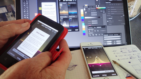
While doppel is simple, creating and saving rhythms with specific beats per minute is impossible to do without a screen. As such, we created a companion app.
What inspired our UX
UX stands for User Experience.
The first step in designing any app is understanding what the user needs, wants, and expects it to do. It is then designers job to design a simple, easy, and intuitive path for the user to follow - the experience.
App design is an incredibly fast moving industry and as yet there is no standard/expected layout or structure. There are trends, but these alter swiftly.
But regardless of trend, we always felt that it was essential to keep the amount of time the user spends on the app to a minimum. We wanted the user to focus on doppel’s effect instead.
Initially we mapped out the user journey to understand what pages and experience we needed to design.
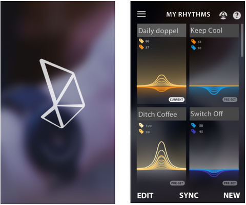
As a minimum, the doppel app needed to be able to:
- Capture the user’s resting heart rate if it not already known
- Suggest pre-set rhythms pairs based on their heart rate and our research
- Give the user the opportunity to change the presets, and create and save new rhythm pairs
- Sync their chosen rhythm with the device
After further testing we also decided to add:
- The ability to change the intensity on the app, not just on the device
- The ability to test different beats per minute on doppel before sending a rhythm pair
All of these features were built and then tested and tested and tested!
The next step is to see what our customers think. We will then continue to update the app based on feedback and usage data. There’s no final step on UX design - the testing and updating never stops!
UX in focus: The rhythm slider
Choosing the perfect rhythm is the most important feature of the doppel app.
The app comes with pairs of preset rhythms but these need to be personalised to the user. First we ask the user to take (or enter) their resting heart rate so that the presets can be adjusted based on their physiology, but from our testing we know that users often want to tweak their settings slightly.
Quite quickly we decided that there needed to be a better way for users to test different rhythms than repeatedly sending different variations to their device - especially when it’s very hard to imagine the difference between, for example, a rhythm at 65 beats per minute and 68 beats per minute.
As such, we created a ‘live’ rhythm slider. As you slide the wave up or down, your doppel will adjust live and change the rate of the beat it’s vibrating at. This allows the user to test our different beats per minute before saving the change.
What inspired our UI
UI stands for User Interface. This is the colours, layout and feel of the app.
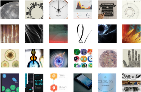
First, as a team we picked out what we loved and hated about existing app trends, features, and aesthetics. We looked both at competitors and companies with similar brands to ours.
Each member of the team then searched out images exploring colours, forms, animations and graphics to create mood boards. These mood boards helped us to create a set of initial concept designs that we critiqued and developed.
Once we had prototyped our rough layout and our rough aesthetics we could start testing it with our potential customers. This helped us go through an interactive design process to ensure that the app navigation was as simple and intuitive as possible. We used physical screen prints out before progressing to tools like Flinto.
User testing is not a process that you do once and forget about. You keep testing and testing and testing after every change to make sure as much bias is eliminated as possible.
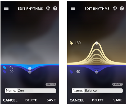
UI in focus: doppel’s rhythm ‘waves’
Whilst it’s possible to choose a beat per minute from a list, we wanted to show graphically how each rhythm is related to the user’s resting heart rate.
And as doppel always holds two rhythms, we also felt it was important that both rhythms should be seen at the same time.
The ‘wave’ we eventually decided on was derived by a mixture of aesthetic inspirations, primarily an EKG heartbeat graph, but also from radiating ripples from a central fixed point. It also allowed us to easily display two rhythms at once and easily show users their rates relative to their resting heart rate.
What do you think of the look and feel so far? Let us know in the comments!